Best Law Firm Websites for Web Design Inspiration


Too many law firm websites today are focused on bragging about the firm's accomplishments and years of experience.
Nobody Cares About Your Law Firm
In all honesty, nobody cares about those accomplishments. They can help for sure. But what people really care about is how you are going to use that experience to help them get through this difficult, and often emotional, time in their lives, here and now.
Start With the Copy
No question, the text on the page is the most important part of your website. In basic terms, your website's copy should tell the user what they will get out of your services, and what that means for them emotionally, financially or physically.
Design Around The Copy
Once the copywriting is in place, your law firm's website design should help give emotion to the text. Images, shapes, and motion can be used to help the user understand what they should be thinking or feeling.
Call the Customer to Take a Specific Action
What do you want the customer to do? What will happen once they do that? Don't be vague and mysterious. Make it simple, clear, and inviting.
Below are 7 effective law firm homepages for generating leads.
7 Fantastic Attorney Website Homepages
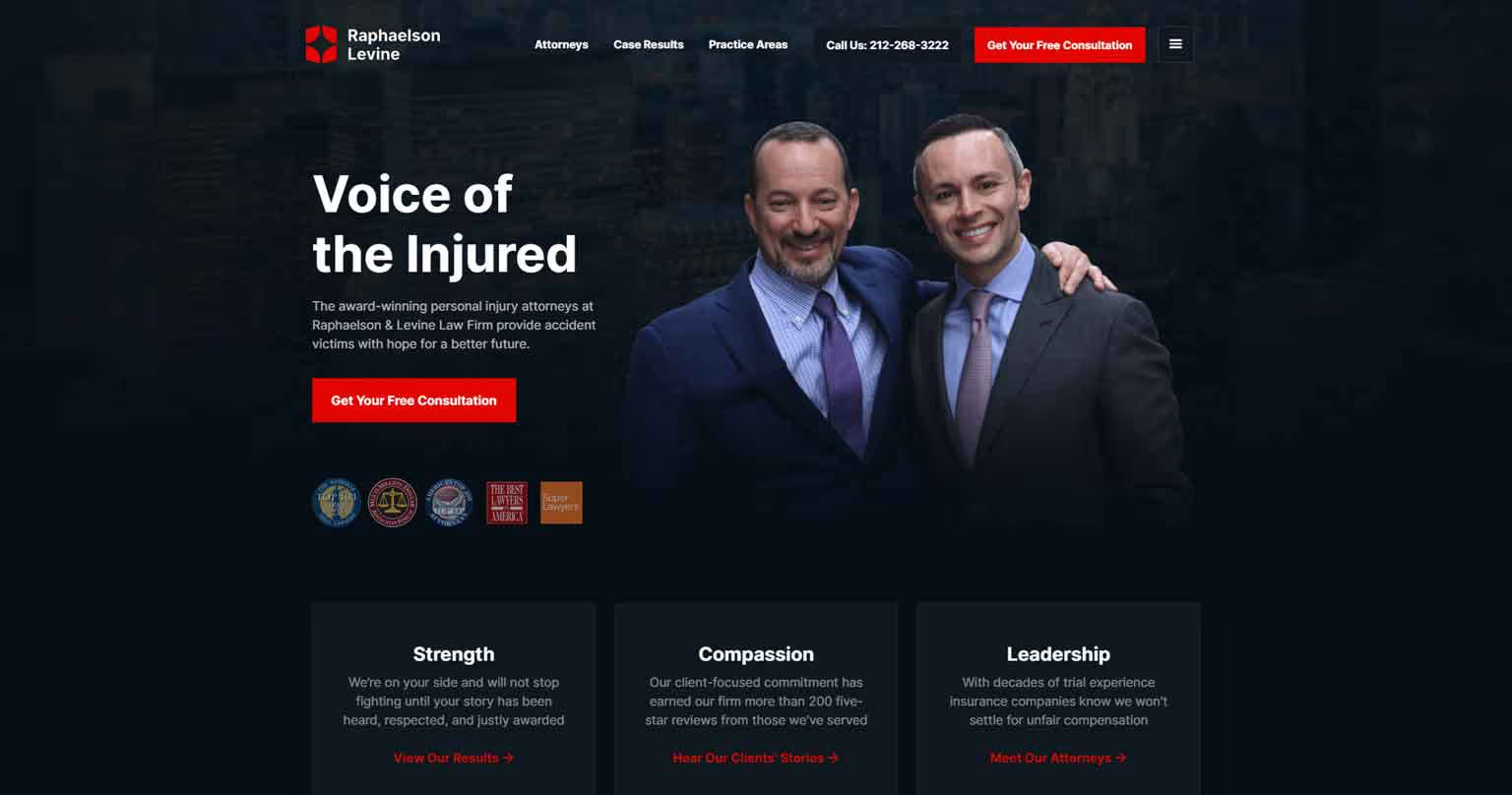
What the website does well:
- Design & Colors - Not many websites can pull off the “contained layout” style anymore, but they’ve done a phenomenal job keeping most everything close together on the screen while not overdoing it. Not only that, but they also pulled off the darker theme background, which is no small feat.
- Shapes - The shapes are super simple, keeping everything in sharp boxes.
- Calls to Action - Consultations are completely free, and they’ve done a fantastic job of making that clear and giving you several options of contacting them.
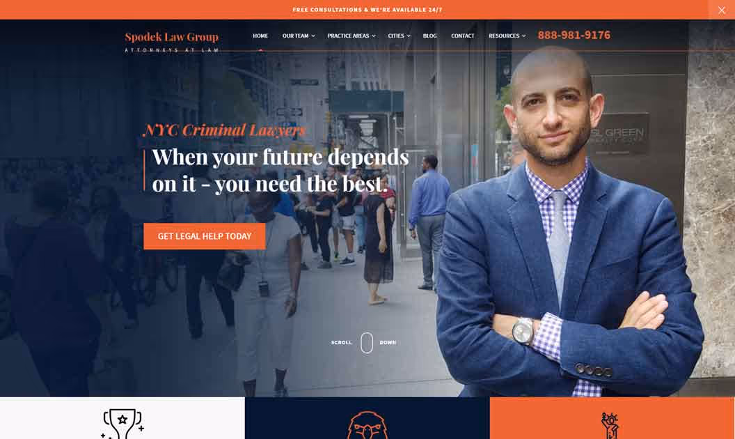
What the website does well:
- Colors - The first thing you notice upon entering is the vibrant colors that radiate energy and confidence.
- Emotion - The header is clear and carries emotion: “When Your Future Depends On It…”
- Proof - The homepage is littered with proof of getting results for their clients and testimonials from said customers.
- Flow and User Experience - Outside of the portion of overused text about ¾ of the way down the page, the website flows smoothly from section to section and could convince even me to contact them.
3. Sweet James
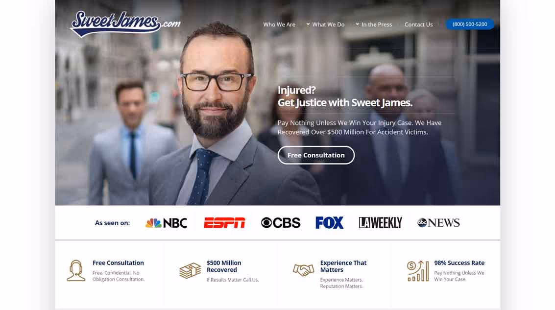
What the website does well:
- Layout - Another website that does a fantastic job with the contained layout.
- Logo - Great logo (or rather the typeface used).
- Proof - The “As seen on” logos just above the fold immediately stick out to me, and it gives credibility to Sweet James.
- Copywriting - The header is clear: Injured? Contact Us. And their competitive advantage is immediately thrown in your face, “Pay nothing unless we win.” Awesome.
- Calls to Action - Something they also do really well is the contact form in the middle of the page. Most websites wait until the bottom of the page to add the contact form, but they’ve decided to add it sooner. Great idea. If the customer is ready now, why oversell them? Just let them contact you.
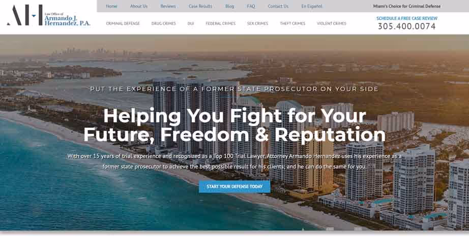
What the website does well:
- Copywriting - I love the opening headline. It speaks directly to what the customer is going to get out of hiring the firm.
- Imagery - The firm resides in Florida, and you didn’t need to see the footer to know that. The images on the website scream Florida and should make Floridians feel at home upon entering.
- Basic Design - The design is pretty simple, but it's enough to convey their message.
5. Walker & Walker Law Offices PLLC
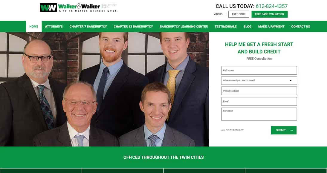
What the website does well:
- Call to Action - They decided to go with the bold contact form immediately upon entry. What I love about the form is that it speaks directly at their target consumer “Help Me Get a Fresh Start and Build Credit”. Excellent.
- Simplistic Design - The design itself is nothing crazy, but it does the job of highlighting the content, and there are no wasted sections that are added just to fill in space. Everything was added for a purpose.
6. The Maine Criminal Defense Group
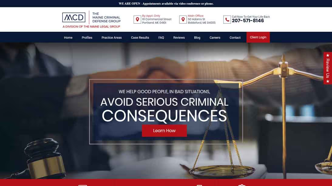
What the website does well:
- Practice Areas - The MCD team does a great job of making their maine (pun intended) practice areas clear.
- The Process - What I absolutely love is that they’ve created a seven step process of what crime victims should expect. Usually, I don’t like to add more than four steps, but in this case, they’ve done a fantastic job minimizing space while making the process crystal clear with the hover effect.
- Social Proof & Calls to Action - The rest is by the book: testimonials, results, expertise, call to action.
7. JCS Law
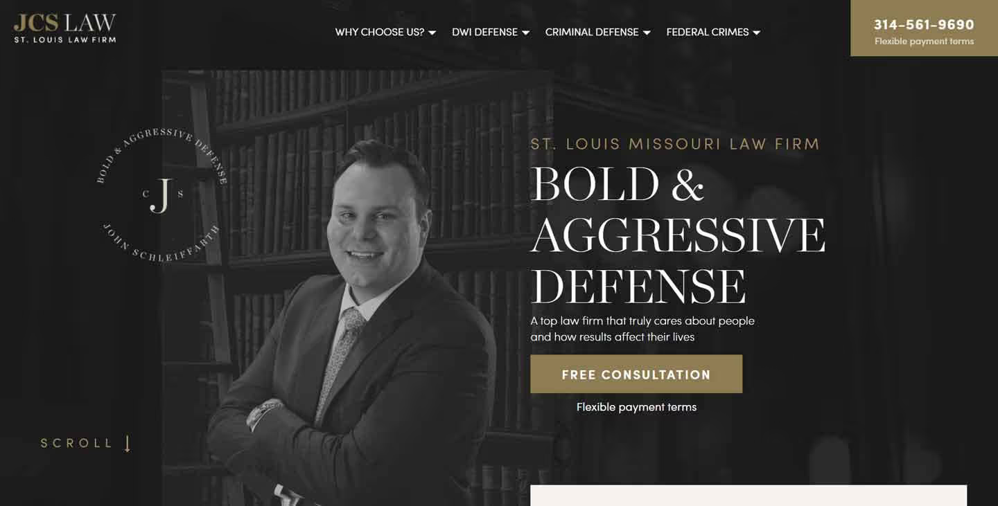
What the website does well:
- Short & Sweet - This is the shortest homepage on the list, but it doesn’t mess around and gets to all of the important information.
- Spacing & Grouping - I love the awards side by side with the practice areas. Great use of space.
- Colors & Feel - The colors scream bold and premium which seems to exactly be the type of service you will receive from the firm.